

Let's start with what's probably true about your spreadsheet.
It works. The numbers in it are accurate. Someone has invested a lot of time in building it, maintaining it, and making sure it reflects what's actually happening across your programmes. It tells you how many people you've served, how attendance compares month to month and how your results are doing in relation to your targets. It's full of powerful formulas and it's doing it's job. But there are some jobs your spreadsheet can't do and as you've grown, those jobs are becoming more important and crucial to the way you deliver impact professionally.
The five things a spreadsheet can't do
1. Disaggregate automatically.
You know how many people attended your Tuesday group in October. But how many of them were women? How many were under 35? How many were from your priority postcode areas? To answer those questions from a spreadsheet, you need either the right formulas, the right pivot tables or the patience to count manually. And if your funders start asking these questions midway through a programme or start requiring demographic breakdowns in their reports, you need to build in that analysis from scratch, every time a reporting requirement changes.
A purpose-built impact management platform can store demographic information alongside attendance data so that you can apply those filters at any point, instantly, without additional work.
2. Track the same person across multiple programmes.
Spreadsheets are usually organised around programmes, not people. You have a tab for your Tuesday group, a tab for your Thursday group, a tab for your online sessions. What you probably don't have (unless you've built something extremely sophisticated!) is a view of every individual. How many of your Tuesday group members also use your Thursday group? How many have been coming for more than a year? Who hasn't attended for the last three months?
These questions are often the most important questions for understanding whether your work is having the impact you think it is. A dedicated case management system with in-built impact reporting will allow you to to track attendance while also being able to see a view of every individual.
3. Show change over time at the individual level.
If you're running wellbeing surveys and collecting responses using Google Forms, Microsoft Forms, SurveyMonkey or a similar tool, you almost certainly don't have an easy way to see how an individual's responses have changed from their first survey to their most recent one. You can look at aggregate distributions. You can compare averages. But seeing that 67% of your support group members reported improved wellbeing between January and December (and being able to show the data behind that claim) requires a degree of connectivity between datapoints that a spreadsheet isn't designed to handle.
Whereas a surveys platform that's connected to a case management CRM is able to join the dots between survey responses for every individual, whilst letting you see the trends across an entire project, programme or cohort.
4. Give your team a real-time picture.
Spreadsheets are retrospective. They tell you what has happened after someone has captured it, after someone has formatted it, after someone has shared the updated version of the Excel file. If you want to know how last night's session went, you have to wait for that entire process to be completed. But when attendance and survey responses flow directly into a platform because you have digital registration forms, digital self check-in links for attendance and digital survey invitations that are all connected to the same system, your team gets a real-time view of what's happening across your programmes, without anyone needing to chase anyone else up for information.
5. Produce a funder report without starting again.
This is the thing that takes the most time and causes the most stress. Whenever you need to produce a funder report, someone on your team has to sit down and reconstruct the story from the spreadsheet. They have to copy results into a document, create charts that match your funder's template and trawl through files and folders looking for relevant qualitative data that didn't make it into the spreadsheet. It takes days to doing something that your data ought be able to do for you automatically.
An impact management platform can turn give you the report you need in a few minutes. The data is already organised, able to be segmented demographically disaggregated and already visualised in charts and tables.
The transition is easier than it looks
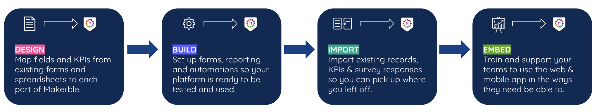
The most common concern we hear from organisations at this stage is that moving to a new system will require them to start from scratch; to lose the historical data they've carefully accumulated, to rebuild everything from nothing and to put their team through a learning curve that will cost more time than it saves. None of that has to be true. Historical data from spreadsheets can be imported directly into Makerble - contacts, attendance records, even historical survey responses if they exist in a structured format. The system is designed to be configured around how you already work, not the other way around. The onboarding process is structured precisely to make the transition manageable: a design phase to map your existing programmes and data structures, a build phase to configure the platform, an import phase to bring your data across, and an embed phase to train your team at whatever level of depth they need.
The goal isn't to throw away what you've built. We'll use it as the foundation for your next phase of growth.
How do you know when you're ready?
You're ready to move beyond your spreadsheet when any of these things are true:
- Producing M&E reports for funders takes more time than it should and the quality doesn't feel as good as it could be
- Your funders are asking for disaggregated data or longitudinal outcomes that you can't currently provide
- You're spending time manually transferring data between systems - registers and surveys to spreadsheets, spreadsheets to reports
- Your team is growing and the spreadsheet depends on one person who knows how it works
- You want to grow your programmes but you're not sure your current systems could handle the additional data
If you're nodding at any of these, the spreadsheet has done its job. It's got you this far. Now you're ready for something that can take you further.
Makerble is designed for organisations that have outgrown their spreadsheets. If you'd like to see what that transition looks like in practice, get in touch or consider a free trial.


.png)

%208.png)


.png)


